
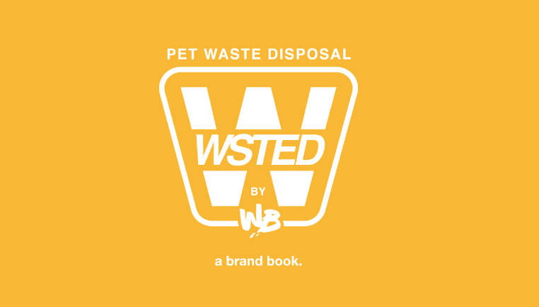
WSTED - PET
PROJECT
WATERBOYS - 2023
WaterBoys
DESCRIPTION
An application of branding as a tool to motivate and enable sustainable waste behaviors within a community, WSTED aims to offer a new perspective on community waste management through our studio brief, brand vision, identity, and composition. The branding for WSTED is an output of our studio's design research focus on reimagining sustainable solutions that can support our local communities and our exploration of Waste Futures.
A Wasted Effort to A [WSTED] Opportunity
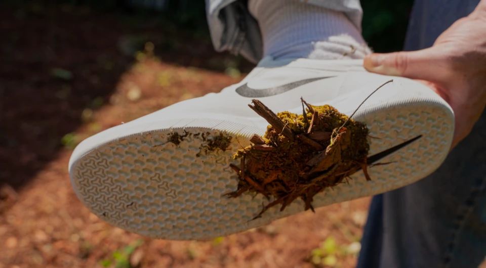
One of the most overlooked challenges that urban communities face is the improper disposal, collection, and management of dog waste. According to the New York City Department of Sanitation, Dog waste accounts for about 4% of the cities total waste stream. Although a smaller portion of the waste stream dog waste poses a major threat to the management of other conventional waste and recycling streams and community health and hygiene. It's also just [DISGUSTING]. We saw this as an opportunity to continue our exploration on waste futures. As a result, WSTED was developed to challenge current waste behaviors, adapt existing infrastructure and resources, and create value and new value chains for communities by re-imagining local waste management for dog waste.
DESIGN BRIEF
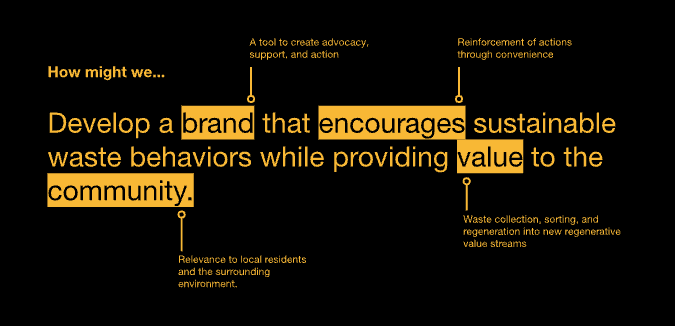
Our design brief outlines WaterBoys' studio objectives and the core research question driving the WSTED project: Can branding encourage the reinfrcement of postive waste behaviors in NYC communities? Can we develop a brand and service that re-thinks waste as something valuable?
BRAND VISION
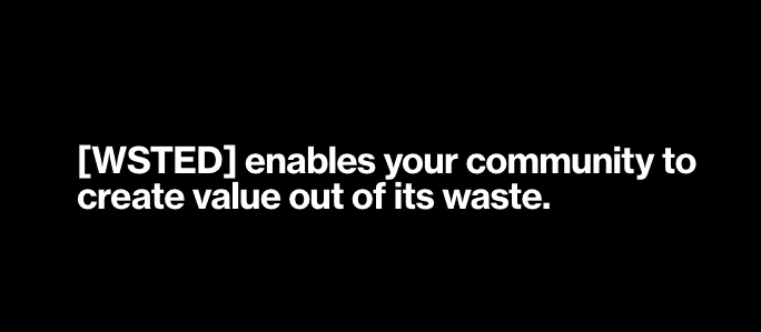
WSTED envisions communities empowered to transform waste into value. Our vision focuses on transforming the way communities handle pet waste, turning it into a resource.
BRAND VALUES
The foundation of WSTED's brand is built on four core principles that we eplored as of the refelction of the communities it operates in.
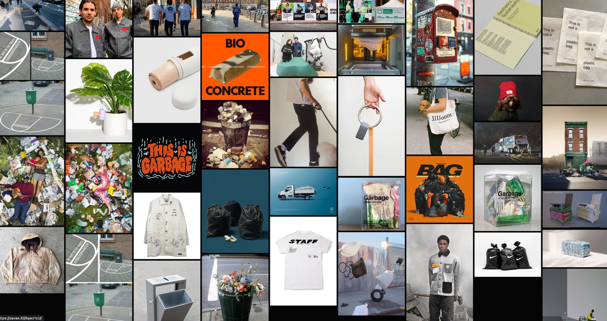
BRAND INSPIRATION
An exploration of the WSTED brand these images summarize the brand design inspiration annd brand ethods. The following images highlight the potential of waste to be reimagined and re-designed, alongside examples showcasing innovative and alternative approaches to product and service design solutions for waste management
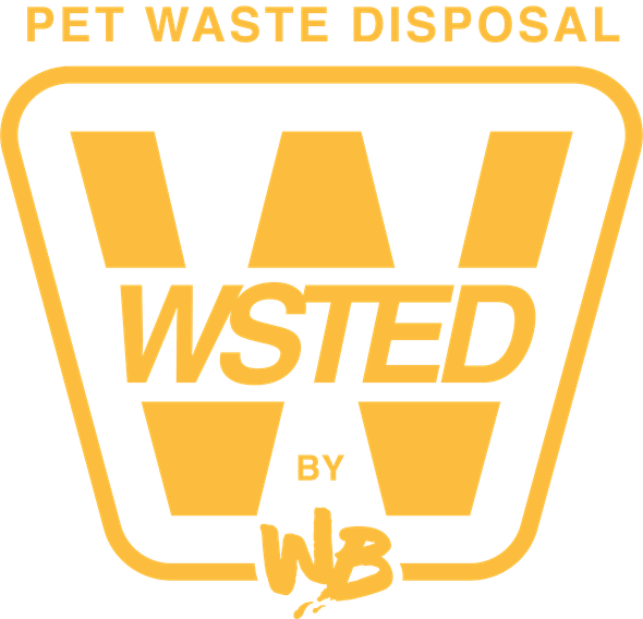
VISUAL IDENTITY AND LOGO DESIGN
The brand insipration heled us create a strong foundation to craft a visual idetity for WSTED. The WSTED logo is a powerful symbol that encapsulates the brand's core values and vision. Designed to be both visually striking and memorable, the logo serves as the cornerstone of the brand's identity.
BRAND INSPIRATION
Key elements for the WSTED logo design include: Industrial Symbol: The logo incorporates a subtle industrial element, reflecting the brand's commitment to practical and effective solutions. This element hints at the underlying processes involved in waste management and recycling. Color Palette: The choice of black and yellow is deliberate. Black conveys a sense of strength and sophistication, while yellow adds a touch of optimism and energy. These colors align with traditional waste management branding while creating a distinctive and modern aesthetic.
BRAND INSPIRATION
Typography: A clean, sans-serif typeface is used for the logo's typography. This choice ensures readability across various applications while maintaining a contemporary feel. The typeface complements the industrial symbol and reinforces the brand's commitment to clarity and efficiency.
BRAND INSPIRATION
Tagline: The tagline "Good Steps Ahead" is integrated into the logo design, emphasizing the brand's positive impact on the community. This tagline reinforces the idea of progress and sustainability.
VISUAL IDENTITY
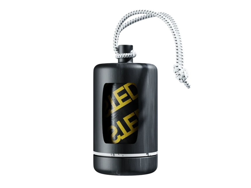
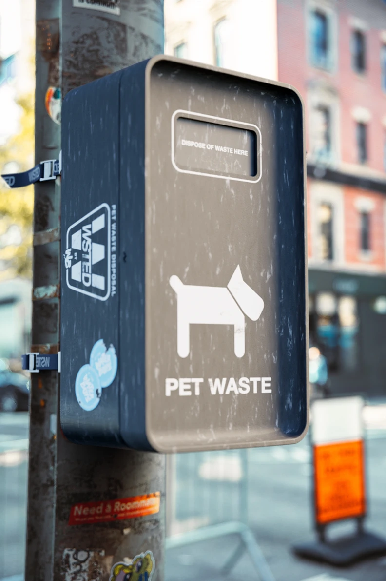
The WSTED brand identity extends beyond the logo to encompass a range of tangible product elements that reinforce the brand's message, values, and visual presence. The WSTED brand identity seamlessly integrates with the brand's product design, such as it's doggy bags and waste collection bins. These products are designed to reflect the brand's function, values, and aesthetic as a community service, creating a cohesive brand experience for consumers.
CAMPAIGN
To demonstrate the branding in a marketing application we developed a campaign for the brand that could be activated in an NYC community.


CAMPAIGN
WSTED's marketing campaign leverages humor and relatability. It addresses the common (and often frustrating) experience of stepping in dog waste, highlighting how WSTED provides a solution to this unpleasant encounter. The campaign amplifies the brand's logo and tagline, promoting the "Good Steps Ahead" message with a lighthearted touch.
Getting our SH**T Together.
Today we are in the middle of a mix of global emergencies that require attention and action. One of the most important emergencies that we face in our urban communities is water scarcity and the growing challenges with access and quality that will continue to compromise the longevity of our cities and populations. In effort to reduce and ultimately prevent more Day Zero events it is critical for us as designers to continue to contribute to the development of new water innovation. These innovations and ideas will challenge traditional consumption behaviors, adapt existing infrastructure and tech, and promote the resilience of our urban communities so we can achieve a positive waste future.
ISSUE 000
Client: COMPANY HERE
Year: NAME HERE

WaterBoys is a design studio committed to re-imagining more resilient cities. We specialize in design applications focused on waste, water, and sustainability exploring innovative solutions for urban challenges. Collaborating with small businesses, artists, and creatives, we develop design research and create products, services, and brand identities for a more sustainable future.
©2024 It's the WaterBoys. All Rights Reserve
Email: Itsthewaterboys@gmail.com
IG: @itsthewaterboys